Role
Sole UX/UI desinger
Timeline
Nov 2023 - Feb 2024
Industry
Risk Management
The problem
Users and product owners are frustrated with unintuitive and outdated navigation
The internal risk management platform of Africa’s largest bank faces significant usability challenges. Users find navigation unintuitive and confusing, often resorting to workarounds to avoid using the menus—I personally witnessed this many times.
Additionally, platform owners struggle to integrate new features into the already bloated menus.
The solution
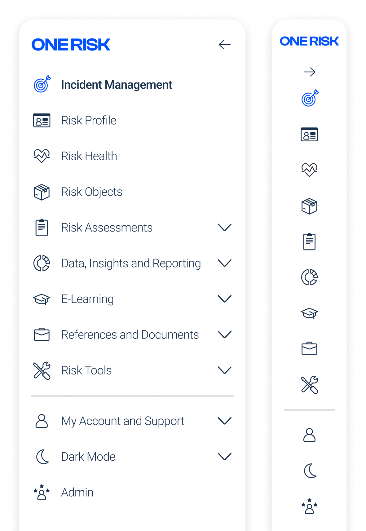
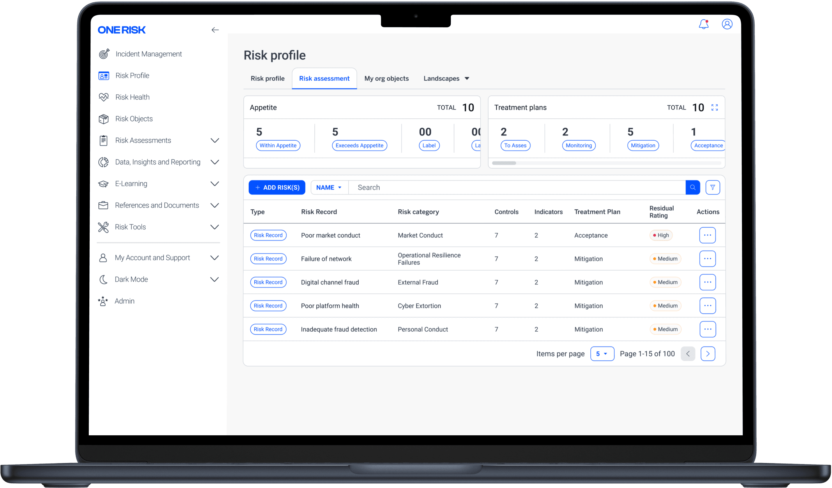
I redesigned the information architecture and introduced an updated navigational system
This project delivered a redesigned information architecture and a new navigation system. The solution was developed through an iterative process involving user research, site mapping, card sorting, prototyping, and user testing.
Each step ensured the new system addressed user needs and enhanced overall usability.
Above: Mockup showing the new menus and information architecture
Unpacking the problem space
Leveraging existing knowledge to prioritise work.
During my initial months on the team, I documented instances where users struggled with navigation and the product team faced challenges in placing new features. When the project began, I leveraged these insights to identify and summarize the key pain points that needed attention. This process enabled me to present the findings to stakeholders, and together we agreed to prioritise the primary issue, which is the focus of this case study.
1
2
3
Above: Prioritised problem areas
Site-mapping
Site-mapping was the key to finding out why users found the menus so confusing
After prioritizing the identified problems, I created a sitemap of the current information architecture, providing a bird's-eye view of the structural issues. Key findings included:
No clear logic in the two largest groupings
Less-important modules prioritized in the hierarchy
Naming conventions misaligned with the modules they encompass
The top-level hierarchy order did not reflect module usage frequency or importance
Above: Current site map
Card-sorting
Defining a shared understanding through card sorting
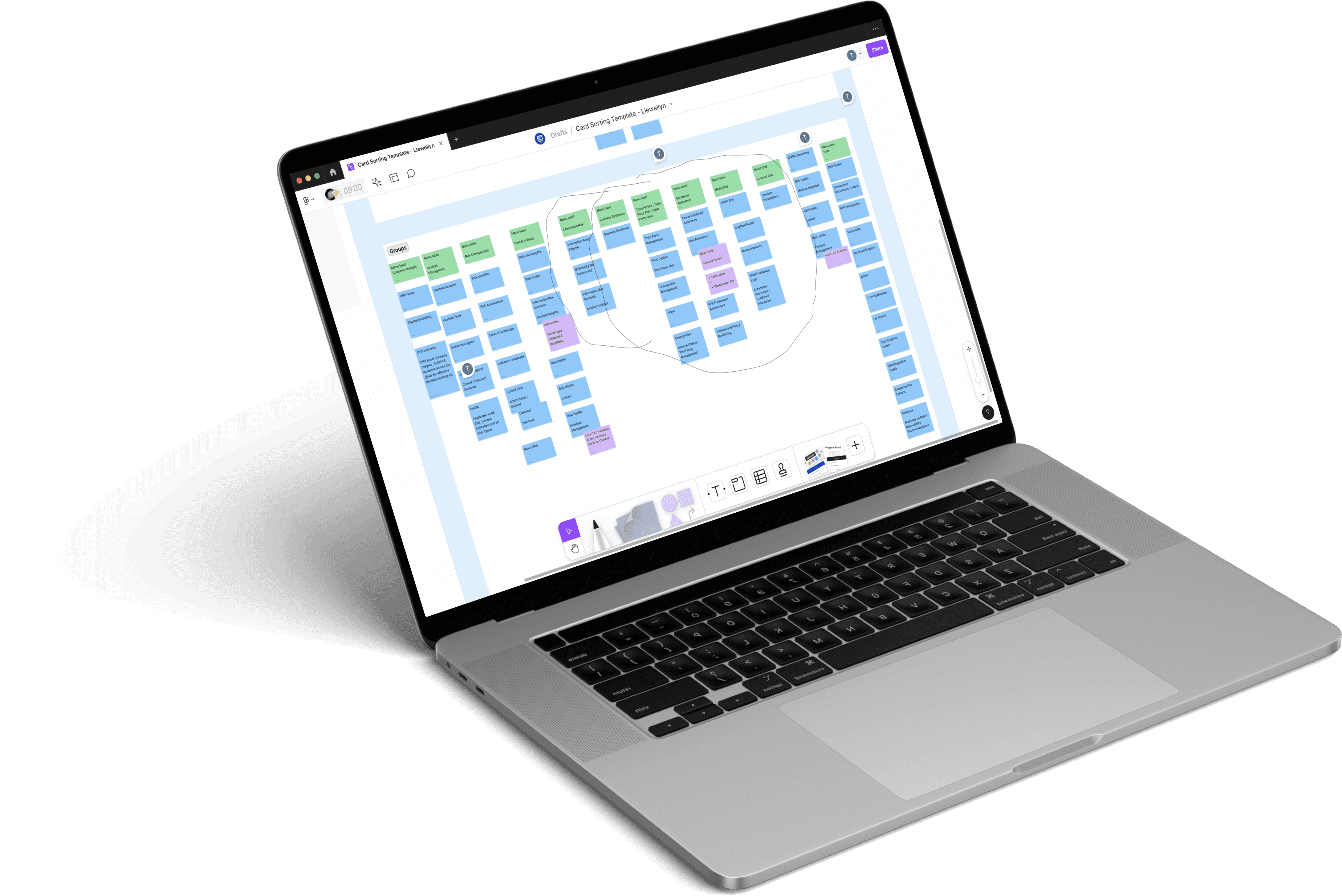
To ensure a new structure was usable for all users, I determined that open card sorting sessions would be essential to proceed.
I collaborated closely with a business stakeholder to identify representatives from all 9 areas of the bank. I then planned, scheduled, and facilitated the card sorting sessions over the span of 2 weeks using Figma and Teams.
11
Users
9
Sessions
The data from the card sorting sessions was then organised and analysed to identify common groupings of pages. I also compared the naming conventions used by participants to determine the most intuitive labels for these categories.
Following the analysis, I created a series of new site maps. These were regularly shared with stakeholders and refined based on their feedback to develop a more intuitive structure that addressed the needs of all impacted parties.
Module name
Frequency
Control Landscape
88%
Indicator Landscape
88%
Risk Profile
77%
Risk Assessment
77%
Risk Health
66%
Risk Identifier
55%
Control First
44%
Assurance
33%
Above: Excerpt from card sorting data
Revised site map version 1
Iterative site-mapping
After collating all the data from the card sorting sessions, I created the first revision of the site's structure. For some of the trickiest modules, I introduced a new category called 'Risk Type Tools' to group all modules related to specific risk types. These modules were more specialised and used by expert users. Grouping them like this kept things findable while opening space for more widely used modules.
However, Product Owners expressed that this might suggest that each of the 17 risk types could have its own category in the future, once again cluttering up the system.
To address this, I had to ensure that the categorisations remained unbiased and did not favour any particular risk types, maintaining a level playing field for all stakeholders.
Above: Risk type tools category
Revised site map version 2
Object vs. task based grouping
To resolve the problem of bias, I consolidated all modules linked to specific risk types into two task-based categories, which were then placed under a single umbrella category: Risk Management.
This solution still incorporated the insights gathered during the card sorting sessions, but also catered for the concerns raised by stakeholders.
After discussing the iteration with the developers, however, we learned that this structure would not be possible due to a technical limitation. At the time there was no capacity to address these limitations, so I had to make further alterations for the final structure.
Above: Revised risk type tools category
Final site-map and strcuture
The final sitemap considered user insights, business requirements and technical limitations
After several rounds of refinement and feedback, I delivered the updated sitemap, which was not only a significant improvement but also immediately implementable by our engineers.
Simultaneously, I was designing a new interface for the platform's menus and standardizing the treatment of tabs and headings throughout the platform. Once all the systems were completed, I delivered a new navigation system that greatly enhanced the user experience.
To summarize, one of the user testers exclaimed, "This is so much better!"
Above: Updated site map
Results
With the new structure finalised, I created an interactive prototype in Figma to test and validate the new structure with users.
The updated menus and structure received positive feedback from stakeholders and resulted in an average decrease of 53% in navigation time and 50% fewer clicks during task-based user testing.
Users also emphasised that the new system was clearer and more intuitive.
Reflections
Special care needs to be taken to ensure that insights gathered from users are considered while also listening to what business wants. The key is to find the solutions that balances the requirements of all parties.
No matter how certain you are of a solution, there will always be more room to improve it further through an iterative approach.
All members of the product team need to be involved to come up with a solution that is intuitive but still feasible.


